Category Archives: artist profiles

Artist Profile: Ryan Jerzy

10390985_775460429155415_6849580416191527627_nArtist Ryan Jerzy was born outside of Detroit and raised in the western suburbs of Chicago. 30 years old, Ryan has been making art since high school but found his greatest influence in the music of Phish. “My first linoleum block print was in 2004 for Phish at Coventry. I saw Jim Pollock’s art, saw how he did it, and Isadora Bullock’s art as well, so I decided to try carving a block.” And with that, Ryan Jerzy’s lino cut style has blossomed over the past decade.

Ryan’s style of art draws upon humor and cartoon-inspired design. “I try to create art that is both comedic and unique in a way that people look at it and it puts a smile on their face,” noting that his art attracts children as well as parents who find the all-ages humor in his pieces.

A fan of 18th century etchings, old school printing and typefaces, lettering and fonts, Ryan sees the benefit to simplicity in using just one or two colors to get a point of the work to lift off the page, along with the detail and imagination behind the art.

This summer, Ryan will be making prints for the Clarkston, Chicago and Commerce City shows, as he is planning a move west to Denver prior to the shows Labor Day weekend. With luck, fans will find that Ryan has made some smaller art prints using smaller linoleum blocks. Stay tuned for info on those.

Below is a gallery of Ryan’s Phish inspired art. Availability is noted below the title of each piece. For those that are available, you can pick up Ryan’s available prints exclusively in the PhanArt Store.

Festival 8, 10/31-11/2, 2009. Sold Out

An Interview with Colorado Artist Michael Boyer

Michael Boyer is a talented artist on the music scene who has many different artistic skills and is the owner and creator of Boyer Apparel & Screen Printing based out of Boulder, CO. I had some time after Fall Tour was over to chat with Boyer about all the projects that he does and to find out his inspiration on everything he does.

Kelley Zilembo: Seems like this summer and fall Phish tour was a big year for you with your basketball jerseys and posters. How long have you been making/selling your work on Lot and was this your biggest year so far?

Michael Boyer: This was a big year. I have finally found a way to combine my favorite thing in the world (Phish), and work. I have been selling my art on lot since 2009 (3.0), but it evolved significantly in the past five years. This was undoubtedly my biggest year so far.

website nuggets

KZ: I have seen so many of your jerseys and shirts being worn at shows this year. What was your inspiration for them?

MB: There are so many lot shirts. It seems that 90% are spin-off’s on famous logos. They are fun tees, but not very original. I wanted to bring something brand new, something fresh. I wanted to create a higher-end collection that only 10% of Phans might understand, but find it stylish and original. The ‘Page Side, Rage Side’ tanks were so popular that I wanted to keep it sleeveless. Jerseys seemed like an original option, so I sat on that thought for a while. If I were to do jerseys I needed names on the back, and I figured the most household names were Escuandolas (Antelopes) and Rutherford (Lizards).

Screen Shot 2013-10-01 at 3.01.24 PM

KZ: You have Lizards, Llamas, Mockingbirds, & Antelopes with different numbers on them. What is the significance of the numbers?

MB: The numbers are my favorite part. Signed and numbered posters make the artwork one-of-a-kind, so I figured I could do the same for jerseys. None have repeating numbers. I plan to go to 99 and then produce “away team” jerseys with different colors.

Screen Shot 2013-09-30 at 7.00.45 PM

KZ: You have done posters for Phish, STS9, Disco Biscuits, and Big Gigantic Conscious Alliance. Are all these bands that you follow and enjoy, and does that help with finding inspiration to make art?

MB: I like seeing all those bands, but especially STS9. I developed my first real emotional connection with music via STS9 in 2006. They are a huge inspiration. I couldn’t thank them enough.

sts9 2012 2013-31 copy

KZ: We seem to run into each other at most Phish shows. What got you into Phish and how many shows have you seen?

MB: I remember listening to David Bowie sitting in the passenger seat of a Culver’s parking lot in high school. That was my first “holy shit” moment. I really fell in love with the band after the 2009 Saturday Red Rocks show. I think I’m only at 61 shows.

KZ: What were your thoughts on the Atlantic City Run and Phish covering themselves with new material?

MB: I loved it! Before the music started I was disappointed. I thought it was a pre-holiday marketing scheme. After reading the Playbill, hearing the second set, and the rest of the AC run, there was no doubt in my mind that Phish was authentically stoked to play their music. I feel the main goal of an artist is for the crowd to understand the love and passion behind their craft, and they couldn’t have done that any better.

536517_10101633938121720_2065415565_n

KZ: You do so much other types of art, like wrapped jewelry and custom apparel clothing. Which is your favorite or most inspiring type of art to make?

MB: Jewelry. I love it. The pursuit of perfection really turns me on. The medium is evolving very quickly and leaves so much opportunity to innovate. I love creating something no one has seen before. Each piece is unique and original and the response I get from wire-wrapping keeps me alive.

71742_10102266377762610_451401694_n

KZ: The wrapped jewelry seems like it takes a lot of time, energy and detail to complete just one piece. How did you get interested in making it, and how long did it take for you to master doing it?

MB: I’m no master, but give me about 5 more years. I saw my first wire-wrapped pendant in 2005. I always love the natural perfection of birthstones, and I have always been an “artist”. I figured combining the two would be a good outlet. I gave it shot, and I was terrible and frustrated, but I seemed to love the outcome regardless. I wanted to be the best, and I still do.

407595_10101977947369430_1705604726_n-1

KZ: Can you briefly explain the process of making one piece of wrapped jewelry from start to finish?

MB: A lot of planning, staring, twisting, caffeine and NPR podcasts. Remember lanyard? It’s kinda like that, but far more time consuming.

526599_10101430395363040_707388784_n

KZ: You also make hats that have similar designs to some of the custom apparel that you have made. When did you start making hats?

MB: I started with hats about a year ago. It suits my “vector based” illustration style. There is nothing like seeing someone across the country wearing one of my designs on their head.

521483_10102122455229520_1938535838_n-1

KZ: In 2012, you came out with the ‘Page Side, Rage Side’ shirts, which where a big hit. How did you conceptualize the idea and design?

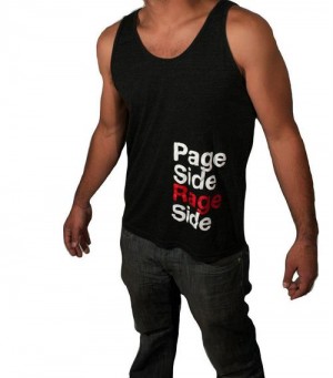
MB: That was my first Phish related design in 2009. They were not a big hit when I started, but after a few years of redesign, it has become very popular. I always heard people screaming, “Page side, Rage side.” I placed the design on the left side of the tee, and kept it really basic: Helvetica font, with two colors on black. It seems that folks on lot love selling “hippy dippy” flowy 1960’s art. That was never my style, and I think a lot of Phish fans don’t go for that either. A few years ago, I saw a “Mike Side Right Side” tee with the same color and font printed on the opposite side. That’s when I knew that my tee was a hit.
409265_301810199877114_586501611_n

KZ: For other custom apparel, how does that work and what kind of things have you already made for fans?

MB: I started making custom apparel for commercial purposes. If the sprinkler company needed 100 tees, I was the guy to do it. As my design skills evolved a handful of retail brands and popular JamBand names approached me for help. I started designing for pennies, but remained persistent. Now, designing and printing retail is a major part of my business.

426527_301809516543849_26297899_n

KZ: Are you working on anything new for Phish playing at MSG for this upcoming New Year’s Run?

MB: Hmmm…we’ll see. I’d like to keep the ball rolling with Phish merch, but its really tough selling in NYC. Expect to see me a lot in 2014.

Best of PhanArt 2013, Part 3

Well, here we are. The Top 6 in the Best of PhanArt 2013. The art has simply continued to get better and better each year, just like the band. The mutual inspiration is pretty awesome to experience. A big thanks to Kelly, Chris, James, Chris and Taylor for their help in running PhanArt with me this past year, as well as their help at the art shows, without them I simply couldn’t keep up with the site. As far as art shows, you can expect at least one this year; more details to come once we get tour dates!

The Best of PhanArt list was compiled based on feedback received through the site, on tour, and through Facebook and Twitter. Fans were asked in the past month what was some of the best Phish related (non-official) art of 2013 and they responded. I took all suggestions into account and looked at the list and came up with the top 13, as well as the honorable mentionsToday we complete the Best of PhanArt 2013 and wrap things up with the top 6 pieces of original fan-made art from 2013. Be sure to check out Part 1  and Part 2 from yesterday.

Remember, the Phanart made in 2013 was amazing and the following is just some of the best. If you think something was overlooked, share what was missed below in the comments section below.

#6 Duke of Lizards by AJ Masthay

It’s tough to pick just one of AJ’s posters from 2013, but fans were pretty unanimous in selecting his SPAC triptych for the Best of PhanArt. Focusing on the Victorian aspect of the springs and baths in Saratoga, AJ brought the Lizards for a stroll through the mansions and halls of the historic town. AJ’s work has been a staple for Phish fans to gaze upon for years now, with many asking when he will do an official print. It’s a fair question, but AJ has been doing some incredible posters for Umphrey’s McGee, Widespread Panic, Yonder Mountain String Band and multiple festivals around the country. As AJ’s intricate linoleum block printing method grows in popularity, I think we aren’t too far off from an official Phish print.

13SPACtriptych_72dpi
Click to check out the detail!

#5 Commerce City by Ryan Kerrigan

Ryan’s daily mandala’s are a treat, but this sun-mandala setting behind the Rocky Mountains and shining down on the crowd at Dick’s is a visual spectacle. Very much creating a three-dimensional image, the sunlight over the imposing mountains mimics Kuroda’s lights on the crowd at Dick’s, with fist-pump guy making a return appearance (he was in the bathroom during The Gorge). Full of detail and color, Kerrigan makes the Best of PhanArt once again, with fans calling this one out for the list months in advance.

kerrigan commerce city 2013

#4 Fall Tour Puckheads from Branden Otto and Chatterbox

Designed with Chatterbox, Branden came up with possibly the most unique piece of art this year. Take the owl – clutching Fishman’s vacuum, with each feather on the wings representing one of Phish’s years from 1983-2013. Then, factor in the venues from Fall Tour – every one was, or currently is, home to an AHL or NHL team, making a hockey puck a perfect representation of the venues, as well as the band playing them. At $20, these pucks sold out quickly. Fast forward to MSG and official pucks were selling for $30 a piece, and not nearly as creative as Otto and Chatterbox’s. Pucking great work guys!

PHISH_30_PUCK_090913

#3 “Fly Famous Mockingbird” / “Joy”  by Isadora Bullock

What a year Isadora has had! These two prints were overwhelmingly the most popular that fans recommended for the Best of, so much that it was tough to pick one over the other, so both make the list. Isadora’s fine detail in her linoleum block printing, bursting colors and mesmerizing design are showing an artist not on the rise, but hitting a strong peak in her craft. Atlantic City’s poster has the Famous Mockingbird flying towards the Jersey shore, with the venue the center of the resonating waves of sound, while Hampton returns us to a church-like setting, because that’s exactly the feeling one would gain from visiting The Mothership; the stained-glass practically pops off the paper. With an art show in Asheville that runs through February (if you live anywhere close, make the trip and check out her growing gallery of great posters), things couldn’t be looking brighter for Isadora.

1395869_566407350081110_1568812091_n 1381947_563923050329540_1842723700_n

 #2 Page Side Rage Side Underwear

You have to recognize a great idea when you see one. Page Side on the front (with a dead fish) and Rage side on the back – do these need to explanation? Hot sellers that blew up the site – PhanArt had more hits in the first two days these were on sale than any other item in such a span of time – these boy shorts went fast, as every guy on Phish tour picked them up for his girl, because why not? And Orange and Blue colors? Wise color choices indeed.

psrs1

And the #1 piece of PhanArt, the Best of 2013 is…….

#1 Heisenberg / It’s Ice shirts/stickers/pins 

Yeah bitch! As if this was a surprise. Clearly the hottest piece of art this year was going to have some pop culture tie-in, as everyone and their brother was fawning over the final season of Breaking Bad. Combine “It’s Ice” and that ‘other’ Ice, throw in some Fishman donuts and the result was a nonstop barrage of “How soon can you print more shirts?”, as one printing sold out after another. The folks at Dogmatagram Designs had a hit and once the sticker became a sought after quick seller, shirts soon followed, and inevitably, a pin. Phish fans love a good pop culture connection to the band and this was one of the best in recent memory. As long as Breaking Bad is a legendary TV show, the Heisenberg/It’s Ice design will live on. Say you want this!

It's Ice Sticker 1-1


image

il_570xN.525052472_e7ch

Best of PhanArt 2013, Part 2

What a year 2013 was! Not only was it one of the best Phish years on record, but there was some incredible Phish inspired art that set the bar high for future years. This is not just a coincidence – when the band is at the top of their game, it rubs off on the fans and art community. Summer Shakedowns were good (despite the rain) and Dicks and Fall Tour led to some of the most memorable Shakedowns in 3.0, with the highlight of them all being the PhanArt Poster and Pin Exhibition in Atlantic City on November 2nd.

This list was compiled based on feedback received through the site, on tour, and through Facebook and Twitter. Fans were asked in the past month what was some of the best Phish related (non-official) art of 2013 and they responded. I took all suggestions into account and looked at the list and came up with the top 13, as well as the honorable mentions.Today we continue the Best of PhanArt 2013 with a look at the art coming in at numbers 7-13. Be sure to check out Part 1 from yesterday.

Remember, the Phanart made in 2013 was amazing and the following is just some of the best. If you think something was overlooked, share what was missed below in the comments section below.

#13 Erin Cadigan’s Halloween poster Le P(h)oisson Deguisement d’ Hallowe’en Metropole de Atlantique

Erin’s Halloween print, her third to feature a mermaid, was inspired by vintage French horror film posters. Note the record with the label (translated) “Phish’s musical costume, Atlantic City.” Who knew their costume would be their own music? Another fabulous poster from Erin.

halloween_13

 #12 Julius/Dr J shirts by Brian Zuckerberg, Chris Ehrens, Shawn Dos Santos and Noah Phence

Hugely popular on tour all year, Dr. J is finally connected to “Julius” with proper art and an in your face palmed basketball. Expect to see folks wearing this shirt on tour for years to come.

Fotor1113124443

#11 Jiggs Hampton Poster

Jiggs has been one of the foremost artists to make a name for himself in 3.0, and his posters over the past few years are a strong part of that. His Hampton poster included an intricate representation of the dates and location for the Fall Tour opener. Another sold out poster from Jiggs – job well done!

1456648_10152034203748578_154706876_n

 #10 Andrew Bryant ‘Band in Lights’ pin

When I talked to pinners about some of the best of the year, this was one that kept coming up, with  resounding support for the design. Mini-silhouettes of the band under Kuroda’s lights, in a limited edition of 100, with a perfect quote from “Scents and Subtle Sounds” to cap it off – brilliant. He’s now up to a fourth version of the pin, with pin collectors clamoring for all editions.

1525244_581945658547009_1748226811_n

#9 Tripp’s Commerce City Triptych

We all love Tripp’s Prints! Tripp has posters for nearly every show, and with his Commerce City Triptych, he gave fans a trio to drool over. Rising fish in the morning, shining at noon and setting in the evening are represented in his prints, with the scenic mountains drawn colorfully and three-dimensionally – perfect for a three-poster set for a perfect three night run at Dick’s.

DICKS-ALL3-1mb

#8 Michael Boyer’s Jerseys

At the Summer in Saratoga Art show on July 6th, fans were amazed at the setup of a different poster for each show of the tour, plus, something new – jerseys with characters from Phish songs as the ‘team’ logo. All summer long, Llamas and Mockingbirds were sold on lot, a hugely popular and incredibly unique piece of art. Boyer put great thought into these, and the quality of the product cannot be understated. Look for more jerseys from Boyer this summer, as well as as profile on the artist coming next week on PhanArt.

Screen Shot 2013-09-30 at 7.00.45 PM Screen Shot 2013-10-01 at 3.01.24 PM

 #7 Brian Hill’s Atlantic City Poster

This poster surfaced a few days after Brian’s Hampton poster was seen online, and the lights for Boardwalk Hall were an even greater muse for Hill. Brian was on hand to sell his posters at the PhanArt Poster and Pin Exhibition in Atlantic City, with a huge response from fans who took to his representation of Boardwalk Hall, improving on the venue’s already impressive facade and late night light show.

AtlanticCity-PosterClick-1

 That’s all for Part 2. What made the top 6? Check back tomorrow and find out!

Isadora Bullock Art show in Asheville Friday, January 10th

This Friday, January 10th, Isadora Bullock will have a poster show at Bookworks Studio in Asheville, NC. With over 50 of her prints on display, she will be giving an informal talk about her process in the shop where she makes her prints.

Please join Isadora from 5:30-7:30pm for a wine and cheese reception located at Asheville BookWorks Studio, 428 1/2 Haywood Rd, West Asheville, NC.

The exhibit runs through February 28th

1514277_601276619927516_589040148_n

An Interview with Sean ‘Waldo’ Knight on Early Phish Lots, Knighthood Tees and My Respects App

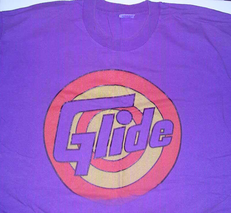
In the history of Phish fans making shirts, posters and other art that was inspired by the band, the starting point for much of the early art is Sean ‘Waldo’ Knight. Well known on tour throughout the ’90s and well into the 2.0 and 3.0 eras, Knight was the founder of Knighthood Tees, which made an extensive line of Phish-themed shirts, including Glide/Tide, 2001/Uno Cards and It’s Ice/ICEE, among many others. Knight’s designs were the most prevalent on Phish tour throughout the 1990s and provided the basis for the wider community of Phish fan art that developed in later years.

Now, living in Humboldt, California, Knight is working on a new venture, MyRespects, while reflecting on his extensive history touring with Phish and setting the stage for the Phish lot and art scene we are so familiar with today. Sean talked with me about his history with Phish, Knighthood Tees and looking back on his years on the road.

Pete Mason: So when was your first Phish show?

Sean Knight: The first show where I got ‘it’ was a few after my first, May 13th, 1989

wally_phanart

PM: You started out going to quite a few shows early on. What was the lot scene like in the early ’90s?

SK: The lot scene was kind of mixed. There was only just me for the most part being chased around by Amy Skelton, but there were a few of us out there, all being chased. It kind of blew up right around 1993.

PM: What were some of the early lot shirts and posters you recall seeing, other than your own?

SK: Not so much on posters but I do remember the Jesus Phish and the Christ Phish (car decals) and the Fish Vacuum (sticker). I was rocking the Antelope and the Glide tee. My earliest design was the Phish Maze, but that one was a no-no… Fishman was wearing a bunch of my shirts, then one night in Rochester he said he couldn’t where them anymore and that I should stop making them. So I did.

8-7-93 front

PM: How did that process get started by which you made shirts of your own? Was it just a random idea and a shirt press? Was there more to it than that?

SK: It was more out of need to go see a show on the clean vibe angle. I made a shirt designed by my buddy Jeremiah, with tourdates on the back for Fall ’93, and one with all of the song titles in fishes, but not the logo. Later on, we would make tees on the road. I would by blank white tees, dye them light purple at a laundromat and we would print them in the hotel. Then I would have to dry them to set them. It was a lot of fun.

got it 3-25 or 3-28 1993

PM: When did Knighthood Tees first take off?

SK: From 1993 to 1996, my business was called Glide Clothing, and in 1996 it became Knighthood. I closed up Knighthood after the last hiatus in 2004. I put all of it away to work in Florida and help with my mom during hurricane season. When they came back in 2009, I started up Jamgoods.com. The lot sales were just so over-saturated so I decided in the last two years to not to really pursue the artwork. The Jamgoods.com brand will develop into another project some day.

sub by jake young glide_1994

PM: When did you take on the moniker Waldo? How did that get started?

SK: It started over 20 years ago. I didn’t know what the (Where’s) Waldo book was all about but when I stopped by a friend’s house on the last day before I did my laundry… BOOM! Waldo was born. My first show as Waldo was a Merl Saunders show in Binghamton, New York, where I grew up. The first Phish show as Waldo was in Worcester in 1993. Back then, you would see Phish and people wanted to dress up in costumes for New Years Eve. It went over amazingly, so I decided to wear the shirt and cap at all Phish shows and Dead shows. It was an amazing experience.

In 2001, Knighthood tees was sued by Phish for infringing on intellectual property, including song names and lyrics that were featured on shirts, stickers and other merchandise sold on the company website. Phish alleged that lyrics and song titles were copyrighted, while Knighthood tees did not. In the end, the parties settled out of court and the suits were dropped. He was also sent Cease and Desist letters by a variety of companies, most notably, Firestone Tires, for his First Tube design. Sean declined to comment on these matters.

KH firstube

PM: What were the years like for you from 2003-04, leading up to Coventry? As a fan who had seem them since 1989, the impact of seeing the last Phish must have had an impact.

SK: As an artist it had an intense impact. I moved from Vermont to clear my head and closed down the shop after having a sale. What I found though was that it was a freeing experience. You see I had this hobby that turned into business and as fun as it may sound, there can be a lot of pressure. By the end of Coventry, it was not as much fun as the early days. “Waldo. Can you still have fun?” used to roll through my head back then.

warren Copy of DSC02402new

PM: What did you do between Coventry and Hampton in 2009?

SK: I started a graphic web design company Edoorz.

KH sanitycolor

PM: Where are you now and what’s the next chapter of Sean Knight’s life?

SK: I am currently living in Northern California. I moved out here right after the Phish show in Atlantic City, 2010, when they did the Little Feat album Waiting for Columbus. I do a lot of non-profit websites and volunteer at my local community radio station, KMUD. The next chapter in my life will always be affected by the Phish scene.

I am currently developing an facebook app called MyRespects. The app was conceived by the loss of friend from tour over the years. I have seen a lot of loss of phans and we lost a good friend that summer (2011) named Scotty. I was not friends with him on Facebook and living in a new area, it was really hard to grieve with friends. I couldn’t post on his Facebook page and as I am going through all this, Phish delivers like they always do- the ‘S’ show for Scotty. This really helped me heal from the loss of a friend.

 MYRhoriz

So on Veterans Day that year, we decided to create this app. The big team on this project is mostly comprised of Phishheads. The My Respects Facebook Memorial Pages Application will allow you to create an interactive Memorial Page which will serve as a digital tribute and legacy for your loved ones, a deceased pet or even yourself.  These Memorial Pages are specifically designed to be interactive and wide reaching; encouraging family, friends and acquaintances around the world, to share their memories and feelings with other grievers, creating a respectful community of grievers facilitating understanding, communication and healing.

We decided to launch an IndieGoGo campaign and we are raising $6,500 in  funds to finish the app development phase and bring it to Facebook sometime in 2014.  To see more about this app and receive updates on Facebook, visit the My Respects page. 

Original Big Cypress and Vegas ’03 Prints by Eric Hanson

You read that right. Artist Eric Hanson, one of the first artists profiled on PhanArt.net in 2009 has unearthed original prints he made for Big Cypress in 1999. These are Big Cypress originals – not reprints, all unsigned and unnumbered (the green variant sold out at BC), these are the last remaining prints among the 2000 prints that were made for the Big Cypress show. All these posters were screen printed on hemp paper. With only a dozen black and three purple, you have a prime chance to pick up some original Phanart from Big Cypress, all for $25.

Big Cypress, 1999
Big Cypress blue, 1999
Blue, Black and Purple variants

Viva Las Vegas Posters from the February 2003 shows at Thomas and Mack Center in Las Vegas. These 20 are part of an original series of 250 signed and numbered prints, color reproductions of original artwork. These posters are also $25. Eric is sharing some great, rare art from 1999 and 2003 at one of the great events of the summer.

eric hanson VivaLasVegas

Order either of these prints at PhanArt.Weebly.com/

BBFCFM Vs. The Mothership A Hampton Poster By OTTO ART

Branden Otto has made a new print for this upcoming run in Hampton. The print is the Big Black Furry Creature From Mars versus the Mothership. This print is available now for pre-order for $20 plus shipping and those prints will be hand printed on October 12 & 13th, which would make them available for shipment the week of October 14th. The print will ship in a heavy duty mailing tube via UPS.

Big Black Furry Creature From Mars versus the Mothership
18″ x 24″
100 lb cover stock
Hand drawn and printed
Signed and numbered
Limited Edition of 100
1380845_574959902567327_377800135_n

Please Click Here for pre-order or purchase.

New Artist Alert: A Song He Heard the Ocean Sing – John Glenn Brings His Unique Style to Posters, Paintings and Boards!

John Glenn, a New Artist to Phanart and native of Asbury Park, draws inspiration from his surroundings, balancing the peace and power of the ocean with the faded glory of a seaside paradise long since lost and its still nascent rebirth. An artist and a phan John  also integrates the music and experiences so many of us know and love into his unique works of art. Plying his skills and inspiration, he uses paint pens and some oils on just about any medium he can – creating works on the canvases, discarded wood and surf boards.

Featured here are some of his works that celebrate the 2012 NY New Years run and the many underwater trips on the train for so many shows at MSG as well as two of his unique hand painted surfboards. In addition to these you can check out John’s other works on his website and of his facebook page.

MSG 2012

J Glenn msg2012 3


 City Trip

Joh Glenn City Trip

Fishman Board                                     Trey Board

boards Glenn

AJ Masthay Releases Fall Prints!

AJ has been hard at work in the studio since Denver coming up with excellent prints for Fall Tour 2013! He is releasing the first two prints of the tour on Friday October 4th at noon EST.

“Killing It”
Hampton Coliseum
October 18-20, 2013
This print is an edition of 200, seven color linoleum block print and on canson edition antique white.
hampton1-1

“Feed Arachnid”
DCU Center
October 25-26, 2013
Worcester, MA
This print is an edition of 100, seven color linoleum block print and on canson edition antique white.
worcester1

AJ will also be doing a special “From the Crypt” selection from his archives during the month of October. He will be celebrating past Halloweens along with some other falls tour shows by releasing a couple of prints each week. Keep your eye out for them to drop starting on Friday October 4th.

For these new prints and the others, please visit Masthay Studios