Counting down the minutes until Phish takes over Dick’s for Labor Day weekend? Feast your eyes on this new treasure from Masthay Studios. Meet Dick and leave the ordinary behind to dive into an alternate reality where everything is possible and anything goes. This print’s so sick – angels weep. On sale Friday, August 16th at noon from Masthay Studios. Get Yours! And whatever your do – Don’t Blink!
Caleb Williamson, who previously made a sweet Land of Lizards map, has made some solid limited edition Summer Tour 2013 posters. His Summer Tour 2013 print is a psychedelic illustration of some of the wilder faces you’ll run into on the road, in the lots, and in the crowd on tour. The characters also represent the variety of tones the band’s sound has taken over the past summer. Like their jams, some are sinister, some are beautiful, some are full of humor.
These prints measure 11″x17″ and are printed on high quality card stock paper. Posters are hand drawn and digitally textured. The posters are in a limited edition of 30, both the Alpharetta poster, and the Summer Tour poster. Each poster is signed and numbered by the artist. Each poster is $15 which includes shipping and a bonus print from the artist’s collection of Phish related art!
This is a five-color linoleum block print by Eric Eskildsen of Osso Inc., to commemorate the three night run of Phish at Northerly Island in Chicago. The size of the poster is 15″ x 22″ and is printed on archival Stonehenge black paper using archival oil inks in an edition of 50. Each poster is $30
Erik’s inspiration for this print was the old ship paintings where a boat is getting pummeled by the sea and storm with no refuge in sight, yet this kraken kept coming to his mind. With the skyline of Chicago in the distance and Northerly Island the only thing between the ship and certain death.
Can you guys smell that? That’s the smell of the West Coast dates being just around the corner.
Get ready for the West Coast with this new print from Lizzy Layne inspired by the Gorge, and stylized around Fishman’s attire. This is a three color screen print, signed and numbered in an edition of 45. It measures 10″ x 20″ and costs $35 + $5 shipping and handling.
You can purchase one of her prints via paypal. Payments can be sent to lizzylayne@gmail.com. You can also use that address to contact her for more information. Check out her full website here: www.lizzylayne.com
This poster was made for the Strangefolk Reunion shows played in late March of 2012. The poster was made as a thank you for donating food to Strangers Helping Strangers. There were a few left over and PhanArt has offered to help Don raise some money for SHS by sharing these online.
The prints are not signed or numbered, but they are printed on glossy paper and all monies after shipping will benefit SHS. The cost for each print is $25 including shipping. Comment below the poster if you would like one. There are only THREE left.
A poster to benefit Mockingbird Foundation is now up on ebay. This poster was made by Jeff Wood of Drowning Creek Studios for Jamcruise 11, January 7-12, 2013. The ship featured more than 20 bands and various musicians, including moe., Medeski, Martin Scofield and Wood, funky METERS, Karl Denson’s Tiny Universe, Femi Kuti & The Positive Force, JJ Grey & Mofro, Ivan Neville’s Dumpstaphunk, and many more.
This poster was signed on January 8th and 10th at the two artist signings in the Disco. Every artist listed above, with the exception of Eddie Robert (from The New Mastersounds) and Femi Kuti and members of The Positive Force, who were getting ready to go on stage. Artists used sharpies in black and gray. They were gentle with the poster.
The profits (less shipping/ebay fees) from the proceeds will benefit The Mockingbird Foundation
Presenting: The alPHabet! This poster, an idea of Pete Mason’s, with a little help from Mike Zwaryczuk, has been brought to life by Ryan Kerrigan. This poster takes you through all 26 letter of the alphabet, with a Phish-spin on things. A is for Antelope, B is for Bathtub, F is for Farmhouse and P is for Possum, among others. This print is great for fans of ALL ages and is suitable for framing and for learning the alPHabet properly.
This poster is printed in an edition of 420, measures 13″ x 15″ and is signed and numbered by the artist. The cost for the poster is $20 shipped. Pick one up below.
Last week, a quite viral chart of characters from The Simpsons were used to describe the fans of 9 Jambands. It took off like wildfire via social media and while making fans laugh at the incredibly spot on connections between characters and bands, it also sparked discussion about other bands not represented. Steve Siegel from The Barn Presents created this incredible chart and talked to PhanArt Pete about what went into creating it.
Created by Steve Siegel
PhanArt Pete: When did you come up with this idea? How quickly did they always come together?
Steve Siegel: It was actually several years ago when I put the whole thing together so the process of creation isn’t really at the front of my mind. I’ve always had a very warm affection for lot shirts and designs that are inspired by popular culture. I always get a ton of ideas for these but my design skills are pretty limited.
A Simpsons design is kind of a shortcut. It’s hard not to get a warm-and-fuzzy when I see Phish shirts like the (Chief) Wiggum/Makisupa Policeman, Willie/Lawn Boy or Barney/The Sloth, but at the same time they are kind of lazy: just slap a song title together with an image of the character. I have always been more impressed with some of the more clever Simpsons related designs: “Lawyers Guns & Money” (Lionel Hutz, Herman the Gunshop owner & Itchy), “Born On The Wrong Planet” (the alien Kang playing a mandolin), even the South Park “Boy Man God Shit”. I love that they used more obscure characters and tried to reach for something that required a beat or two to process and appreciate. I guess these were my main sources of inspiration.
PP: What were your thoughts when going through each band and considering a character for each? Any second guesses or close calls before the finished product?
SS: I seem to remember them coming together pretty quickly; one of the very few practical uses for that weird place in my brain that holds Simpsons trivia. Umphrey’s was tough but I kept coming back to that photo taken from the stage at one of their shows as few years back.
Finally, that squeaky voiced teenager who holds every menial job in the Simpsons-verse (does he even have a name?) just popped into my head. I lucked out on a couple too. Could there be a better image of Moe Syzlak than the one I used for moe.? Just looking at it is funny. I think I cycled through a couple of ideas/characters that didn’t really fit the jamband theme as well. After I published, I’ve gotten some good suggestions through comments, too, (such as) Bumblebee Man for Los Lobos.
PP: Are you surprised at how fast it went viral? It took only a few hours to get over 1000 shares on Facebook and the overwhelming response has been incredibly positive.
SS: Yes and no. I never posted it to Facebook on Friday and wasn’t really looking at my Facebook Newsfeed, so when I finally saw what was going on it was a bit of a shock. My friends were telling me it was being shared by people who didn’t know me or The Barn, popping up in their timelines multiple times. I’ve written some very popular posts before, but never quite like this. I guess I learned a couple lessons, too: 1. It’s a lot easier for people to share an image on Facebook than to click through a link to my site and 2. I should really put a logo or watermark on these things!
At the same time, I guess if anything were to take off, this had all the right elements. I expected this to resonate with people in their thirties or forties. The early-to-mid-90s was an awesome time for both Jamband fans and The Simpsons. Jerry was still around for much of it, Phish was at the absolute peak of their powers and there seemed to be this great overlap of young people that were both open to that sort of thing and could also appreciate how deep, layered and subversive The Simpsons were. Both really reward you for paying attention and at a time where there was far less of every variety of entertainment to distract us, they were the things that really earned our loyalty.
PP: Tell readers about The Barn Presents – what’s your website and what do you cover?
SS: It’s a music blog that tends to have a Jamband focus but really runs the gamut of the broad array of music that I love. I also have a handful of great contributors and am always looking to add more. I try to set it apart in a couple of ways: First is by covering our local scene pretty heavily. I’m from Chicago and there’s always so much great music originating from or coming through here, there’s definitely no shortage of shows to write about or music to share.
I’m also way into data visualization and that has become a secondary focus of the site. I love to not only feature music related charts, graphs and visuals from around the web, but also create some of my own, hence the Simpsons feature. I’ve also done some cool visual presentation stuff with setlists and other band/song data that’s pretty popular. I have plenty of ideas to add more, my only constraint is time!
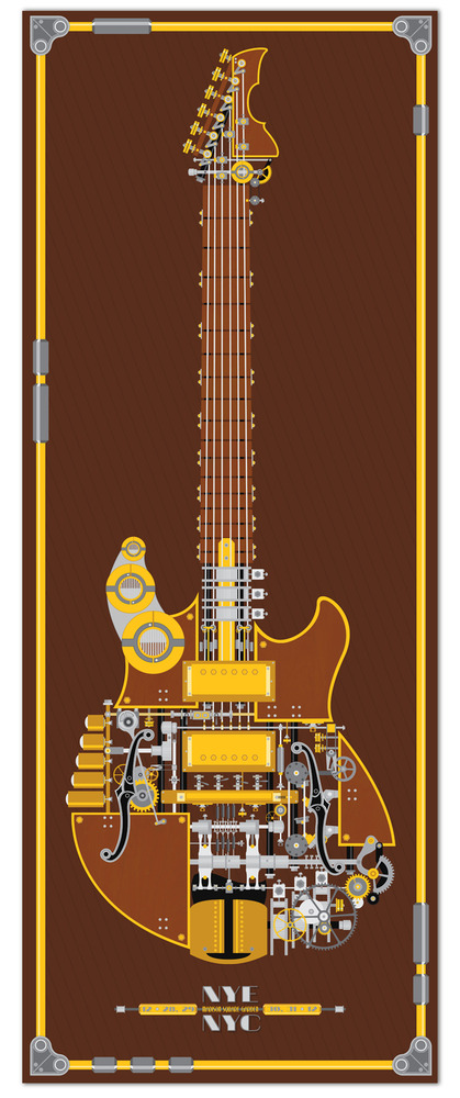
Update 1/21/13: Ben has printed a variant of his NYE print, modified with a new color scheme, printed on Epson Enhanced Matte Paper, with good weight, smooth surface and sharp detail, and printed with Epson archival inks. This print is in a limited edition of 35 and signed and numbered by the artist. You can pick the print up here.
For his latest and final piece of Phish phanart, Ben Whitesell went big. His New Year’s Eve poster is a steampunk representation of Trey’s Languedoc guitar and it’s nearly life-size. The Print measures 15.5″ x 40″. He is only printing 20 of these posters and selling them for $30 + s&h. Each poster is signed and numbered by Ben.
Tim Kelly has created a poster for this 2012-2013 run at Madison Square Garden. The concept came from the idea of the fans taking over the city for four days. Last year, everywhere he went around the city he would see people going to the show, and he met a lot of cool people because of it!
This poster measures 12″ x 18″ and is printed on 90lb watercolor paper. A 3-color silk screen print in an edition of 76. Each poster is signed and numbered. Cost is 1 for $20, 2 for $30